
Did you know that when searching for the Principles of Design on Google, you’ll get a variety of answers that range from five to ten or more? When I went through high school art classes and my university fine art courses, I was always under the impression that there was a specific number for both the Elements of Art (i.e. colour, line, shape, texture, and value) and the Principles of Design...but surprise there really isn’t! The number of elements and principles used in an artwork or project is really dependent on the artist/designer and the message they’re trying to convey in their work. Each artist/designer has their own interpretation of what should be included in the group of design principles for a project and can include as many or as few as they’d like. Below are some Principles of Design and how they are used within an artwork/project:
MOVEMENT – Gives a feeling of motion and helps to show the path the viewer’s eye takes throughout the artwork/project.

HARMONY – Is achieved by using similar elements throughout the artwork/project.

UNITY – Is how well the different parts of an artwork build on each other to appear as a single comprehensive artwork/project.

VARIETY – The quality or state of having different forms or types within the artwork/project.

BALANCE – To arrange elements to appear that one part of the artwork overpowers/seems heavier than other parts or appears to be of equal weight to the other parts (i.e. symmetrical, asymmetrical, or radial).

CONTRAST – When elements conflict with one another in order to draw the viewer’s eye to specific areas (i.e. light and dark).

PROPORTION – Is a measurement of the size and quantity of elements within the artwork/project.

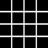
PATTERN – Is showing consistency with colours or lines creating a repetition of elements.
EMPHASIS – Is showing that one part is of more importance or significance than another part of the artwork/project.

WHITE SPACE – Also known as “negative space” is the portion of the artwork/project that is left blank or without text, colour, elements, etc. Leaving lots of white space in an artwork/project helps the viewer focus on what is important.

PROXIMITY – Is where a group of related text or elements are placed together to indicate to the viewer that they are related to one another and become a visual unit.

HIERARCHY – Is when there is a clear order of importance within the elements of an artwork/project making one element appear more important than another.

ALIGNMENT – Is how the elements of an artwork/project line up (i.e. Align Left, Align Right, Align Center, Justify Text).

Comments